You are using an out of date browser. It may not display this or other websites correctly.
You should upgrade or use an alternative browser.
You should upgrade or use an alternative browser.
Your artistic endeavours
- Thread starter Flaming_Tiki_God
- Start date

Uver
Rookie
http://www.facebook.com/home.php?ref=ho ... 4737061227
Thats a video of me playing the bass about 4 days? after I got it. So its not the best, buts its the best I could do.
Thats a video of me playing the bass about 4 days? after I got it. So its not the best, buts its the best I could do.
Flaming_Tiki_God
Rookie
Doesn't sound bad at all to me.
Nice stuff guys. I'm particularly fond of that shuriken, looks simple but at the same time effective. It reminds me of the Zero Punctuation video about Pain Killer, "a gun that shoots shurikens and lightning!" 
I'm a member of deviantART - http://cr33g.deviantart.com - and like many deviantART users, I'm not a very well known or "popular" user/artist at all. But recently someone sent me a private message/note asking me if I do requests. No one at dA has ever asked me to do a request before, it felt honouring in a way so I accepted.
This user asked me to draw their made up fictional character "Hathaway", a female anti-hero/villain assassin type of character (it does seem cliche', I'm aware). She gave me a few of her own drawings as references (which one can be seen here - http://xhathawayx.deviantart.com/art/Hathaway-96494957) as well as some general pieces of information on the character.
Here is my take on her character.

I used a photographic reference for this, because honestly I'm not very good at drawing females. They always look too masculine, so I wanted this character to look proper female. The reference I used was of Quantum of Solace Ukrainian actress Olga Kurylenko. Not only is she incredibly gorgeous but she has that strong, "femme fatale" look about her, a look I found perfect for this character art request. It took me a long time to find a suitable reference photograph but I found out - however the clothing, hair and whatnot is my own design.
Hope you all like it.
I'm a member of deviantART - http://cr33g.deviantart.com - and like many deviantART users, I'm not a very well known or "popular" user/artist at all. But recently someone sent me a private message/note asking me if I do requests. No one at dA has ever asked me to do a request before, it felt honouring in a way so I accepted.
This user asked me to draw their made up fictional character "Hathaway", a female anti-hero/villain assassin type of character (it does seem cliche', I'm aware). She gave me a few of her own drawings as references (which one can be seen here - http://xhathawayx.deviantart.com/art/Hathaway-96494957) as well as some general pieces of information on the character.
Here is my take on her character.
I used a photographic reference for this, because honestly I'm not very good at drawing females. They always look too masculine, so I wanted this character to look proper female. The reference I used was of Quantum of Solace Ukrainian actress Olga Kurylenko. Not only is she incredibly gorgeous but she has that strong, "femme fatale" look about her, a look I found perfect for this character art request. It took me a long time to find a suitable reference photograph but I found out - however the clothing, hair and whatnot is my own design.
Hope you all like it.
NickKmet
Regular
as promised, here's two paintings i did.
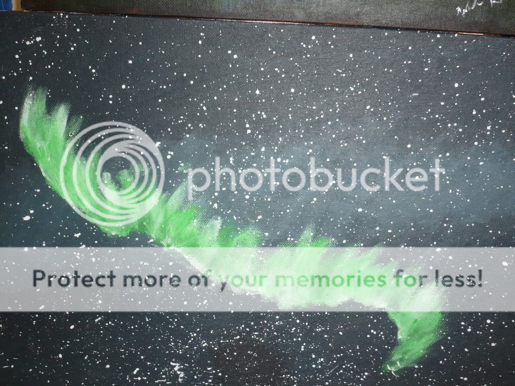
This first one is titled Aurora, and is a painting of the Aurora Borealis.
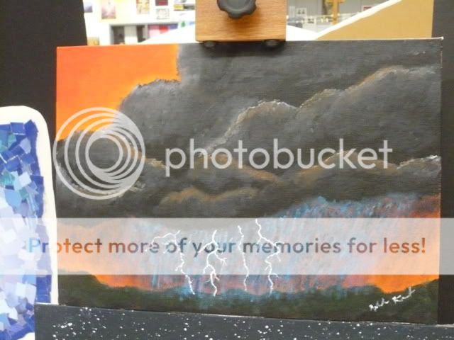
This one is titled storms, and was the best liked painting out of my collection at last semester's art show. It's based off a picture i saw in some book. The quality on this pic is pretty low, and i'm not sure why.
This first one is titled Aurora, and is a painting of the Aurora Borealis.
This one is titled storms, and was the best liked painting out of my collection at last semester's art show. It's based off a picture i saw in some book. The quality on this pic is pretty low, and i'm not sure why.
^Personally I prefer your Storms painting over the Aurora. In my opinion I think the Aurora piece should have some more colours to it.
The Storm piece though is really good, it's got a lot of vibrant colours in it and I'm impressed with the toning and mixture of colours, particularly in the clouds, and the lightning.
Regardless, both pieces are great.")
The Storm piece though is really good, it's got a lot of vibrant colours in it and I'm impressed with the toning and mixture of colours, particularly in the clouds, and the lightning.
Regardless, both pieces are great.
keepithowitis
Rookie
I agree with Craig, Nick.. The aurora one needs a little more color. There's just black, white, green as far as I can tell, which is good for maybe a darker painting. I kinda think of Northern Lights as a vibrant, kinda upbeat thing, so maybe some colors in the stars, and some more in the lights as well. Just my five cents.
I really like the thunderstorm one though. The clouds and the orange sky are brilliant together.
I really like the thunderstorm one though. The clouds and the orange sky are brilliant together.
Just thought I might throw this up here. This is my final piece, the "conclusion" of the "Jake" series that the local group TEAMhealth are comissioning/paying me for. Next up, four more pieces for the "Sarah" series.

What's going on here is that the Jake character is attempting to help himself by going to the website Reachout! - http://www.reachout.com.au - a website/organisation which is, well, pretty much all about helping. Because he's attempting to help himself, the window has began to open allowing natural light to enter the room. This is to imply that because he is helping himself, there is hope for him to have a brighter future.
Hope you guys like it.
keepithowitis
Rookie
Bored in class during a talk about the inauguration..

^Nice Obama sketch. ")
Hey NickKmet, thanks man. I'm glad you like my work and my style.
To answer your question, yeap! It's just a screen shot, but edited and re-sized in Photoshop to fit on his monitor in a sort of realistic fashion.
NickKmet said:I really like your style Craig. It like that visual style.
Question: How did you do the webpage on the screen? is it like a screenshot?
Hey NickKmet, thanks man. I'm glad you like my work and my style.
To answer your question, yeap! It's just a screen shot, but edited and re-sized in Photoshop to fit on his monitor in a sort of realistic fashion.
ScientificDJ
Rookie
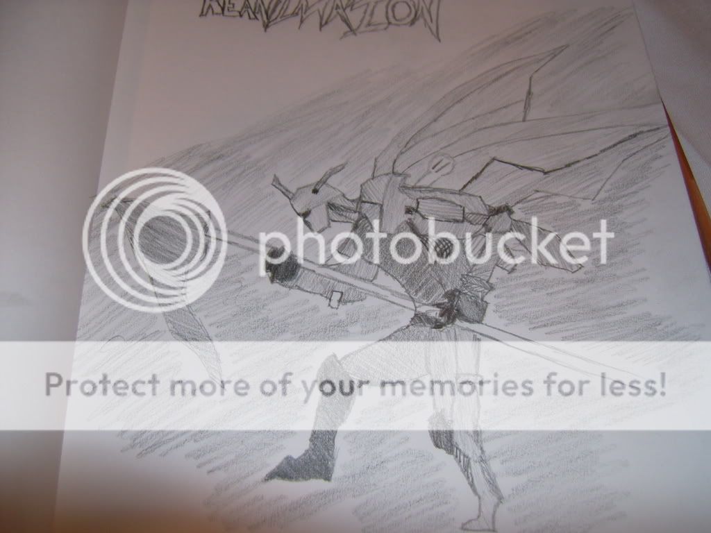
I've attempted and failed to make two movies with my friends (failed because they haven't been finished and they're pretty dodgy), and I've made several short videos with my friends too. My favourite English assignment is a short story I wrote about a street racer. My second favourite is a poem I'll post soon. I've written the first chapter of a book that I may or may not finish, and started another but haven't got even that far. I've created a game using game maker that I'm quite proud of (even though gameplay wise it is decidedly below average). I'm currently writing the fourth episode of a machinima series that I hope to make with my friends and post on YouTube. And I've drawn this picture:
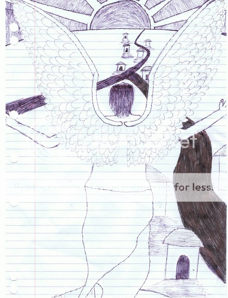
It took me ages to finally draw this the way I wanted, so I guess I'm not a very good drawer as I don't think even the final one is anything a more skilled drawer couldn't do without much effort.
If anyone wants to know more about any of this, just ask and I'll PM it to you. I'll post more stuff up soon.
PS: Good idea starting this topic, I think it looks like it's turned out to be a big success.
UrbanMasque
Everyone Wears a Mask
Master Craig - did you use rotoscoping for that pic?
UrbanMasque
Everyone Wears a Mask
http://www.youtube.com/watch?v=86PiwEYIg4w
please watch in high quality... ^_^
btw - its not a doulbe post b/c i gave ample time in between posts.
please watch in high quality... ^_^
btw - its not a doulbe post b/c i gave ample time in between posts.
Ha ha, UrbanMasque, nice video! 
Not a bad sketch, ScientificDJ. I get what you mean, sometimes it takes ages to get the drawing exactly how we want it and even when we do, we still may not be satisfied with it. It happens with me all the time. It's all about practice and positive thinking, and maybe critique and teaching/instruction from others.
I guess in a way UrbanMasque I sort of did.. in theory, at least (I had to look up what rotoscoping is, to be honest, thank you Wikipedia!). Basically, TEAMhealth supplied me with photographs (which we came up with during meetings, throwing around ideas and whatnot) and when I received these, let's say "custom ordered" photographs, I drew over them in Adobe Photoshop CS2 using my WACOM graphics tablet. Basically, I just draw the basic coloured outlines (or "shapes") on seperate layers so.. t-shirt, neck, head, hair etc... and then I get a little more specific with things like toning, blending of colours etc. It's all digital.
The scenary/setting however is completely my own doing. The original photograph was in an office cluttered with paper and lit up with fluorescent lights, so I had to change the setting to make it look like a kind of dark, depressing bed room. Because of this, I had to work with the lighting myself, and kind of imagine what the lighting would look like in such a setting, if that makes sense.
Hope that answers the question, sorry if I went overboard.
Not a bad sketch, ScientificDJ. I get what you mean, sometimes it takes ages to get the drawing exactly how we want it and even when we do, we still may not be satisfied with it. It happens with me all the time. It's all about practice and positive thinking, and maybe critique and teaching/instruction from others.
UrbanMasque said:Master Craig - did you use rotoscoping for that pic?
I guess in a way UrbanMasque I sort of did.. in theory, at least (I had to look up what rotoscoping is, to be honest, thank you Wikipedia!). Basically, TEAMhealth supplied me with photographs (which we came up with during meetings, throwing around ideas and whatnot) and when I received these, let's say "custom ordered" photographs, I drew over them in Adobe Photoshop CS2 using my WACOM graphics tablet. Basically, I just draw the basic coloured outlines (or "shapes") on seperate layers so.. t-shirt, neck, head, hair etc... and then I get a little more specific with things like toning, blending of colours etc. It's all digital.
The scenary/setting however is completely my own doing. The original photograph was in an office cluttered with paper and lit up with fluorescent lights, so I had to change the setting to make it look like a kind of dark, depressing bed room. Because of this, I had to work with the lighting myself, and kind of imagine what the lighting would look like in such a setting, if that makes sense.
Hope that answers the question, sorry if I went overboard.
masterchris
Rookie
I'm thinking about finally buying some electronic drums... I just need the space now
Similar threads
- Replies
- 10
- Views
- 4K
- Replies
- 3
- Views
- 3K