Homepage Layout Change

schimmel

Rookie
Recently I've noticed that on the home page of GR a small reorganization has taken place. Basically, I noticed that the Daily Manifesto (which is awesome, don't get me wrong) has been bumped up and the reviews and previews have been bumped down. I was just wondering why that is seeing as you're a gaming review site first and a gaming news/editorial site second. I don't really care about the move, I check the home page about once a week and the community page a couple times daily, but I was just wondering why it happened.
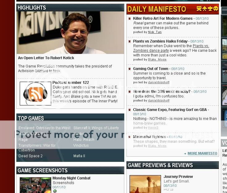
proof.jpg
 
What I want to know is why the fuck you bother to check the community page daily when it's the most dead place on the site.
 
I would be in favor of editorials and opinions taking a higher priority on the site. Currently, the podcast is the best example of what the very bright GR guys have to offer in that regard, but not many people listen to it. Don't get me wrong, you guys still have the best reviews, but more opinion would be fine with me.
 

Members online

No members online now.

Forum statistics

Threads
16,731
Messages
270,928
Members
97,760
Latest member
flintinsects
Top